

Project type
Visual identity & Re-branding
Visual identity & Re-branding
Project type
Pastel.
Hair care products.

Pastel is an established Israeli haircare brand seeking a full rebrand to refresh its identity, unify its product lines, and expand its visual presence.
The goal was to modernize the brand
while maintaining recognition with its
existing audience.

Concept & Approach
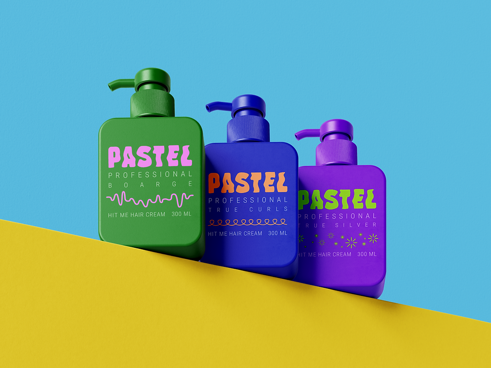
The new identity draws inspiration from Pastel’s diverse product lines and the concept of personalization. Each product series- True Curls, Borage and True Silver received its own color palette and visual treatment, creating a cohesive yet distinctive system. The design balances modern aesthetics with the approachable, professional
feel of the brand.
Old vs New
The previous branding lacked cohesion across product lines
and didn’t fully reflect the brand’s personality. The old logos, packaging, and visual language were inconsistent,
creating a need for a comprehensive redesign.
I designed the new logo and graphic elements, building a flexible identity that works consistently across all touchpoints.


Old logos
Old logos
Concept & Approach
The new identity draws inspiration from Pastel’s diverse product lines and the concept of personalization. Each product series- True Curls, Borage and True Silver received its own color palette and visual treatment, creating a cohesive yet distinctive system. The design balances modern aesthetics with the approachable, professional
feel of the brand.
Old vs New
The previous branding lacked cohesion across product lines
and didn’t fully reflect the brand’s personality. The old logos, packaging, and visual language were inconsistent,
creating a need for a comprehensive redesign.
I designed the new logo and graphic elements, building a flexible identity that works consistently across all touchpoints.
Concept & Approach
The new identity draws inspiration from Pastel’s diverse product lines and the concept of personalization. Each product series- True Curls, Borage and True Silver received its own color palette and visual treatment, creating a cohesive yet distinctive system. The design balances modern aesthetics with the approachable, professional
feel of the brand.
Old vs New
The previous branding lacked cohesion across product lines
and didn’t fully reflect the brand’s personality. The old logos, packaging, and visual language were inconsistent,
creating a need for a comprehensive redesign.
I designed the new logo and graphic elements, building a flexible identity that works consistently across all touchpoints.
Old logos
Old logos
Concept & Approach
The new identity draws inspiration from Pastel’s diverse product lines and the concept of personalization. Each product series- True Curls, Borage and True Silver received its own color palette and visual treatment, creating a cohesive yet distinctive system. The design balances modern aesthetics with the approachable, professional
feel of the brand.
Old vs New
The previous branding lacked cohesion across product lines and didn’t fully reflect the brand’s personality. The old logos, packaging, and visual language were inconsistent, creating a need for a comprehensive redesign. I designed the new logo and graphic elements, building a flexible identity that works consistently across all touchpoints.


Colors, Typography & Icons
The colors are bold yet balanced, designed to stand out on the shelf
and feel fresh and modern.
True Curls series
C 86% | M 79% | Y 0% | K 0%
C 0% | M 49% | Y 67% | K 0%
True Silver series
C 63% | M 83% | Y 0% | K 0%
C 47% | M 0% | Y 100% | K 0%
The Borage series
C 87% | M 24% | Y 100% | K 0%
C 16% | M 57% | Y 0% | K 0%
The typography combines clean, contemporary fonts for a polished
yet approachable look.


True Curls series
C 86% | M 79% | Y 0% | K 0%
C 0% | M 49% | Y 67% | K 0%
True Silver series
C 63% | M 83% | Y 0% | K 0%
C 47% | M 0% | Y 100% | K 0%
The Borage series
C 87% | M 24% | Y 100% | K 0%
C 16% | M 57% | Y 0% | K 0%
Colors, Typography & Icons
The colors are bold yet balanced, designed to stand out on the shelf and feel fresh and modern.
The typography combines clean, contemporary fonts for a polished yet approachable look.


Each icon represents a unique product line, creating a clear and engaging visual system across the brand. Together with the icons, the colors and type create a young, energetic identity that reflects Pastel’s values and enhances its shelf presence.
The Borage series

True Silver series

True Curls series

Each icon represents a unique product line, creating a clear and engaging visual system across the brand. Together with the icons, the colors and type create a young, energetic identity that reflects Pastel’s values and enhances its shelf presence.
The Borage series
True Silver series
True Curls series
Applied Branding
The new identity was applied across packaging, different hair products,
gift sets, cosmetic bags and merchandising, elevating the brand’s visibility and impact and buzz.

Applied Branding
The new identity was applied across packaging, different hair products, gift sets, cosmetic bags and merchandising, elevating the brand’s visibility and impact and buzz.


